Tahoma typeface
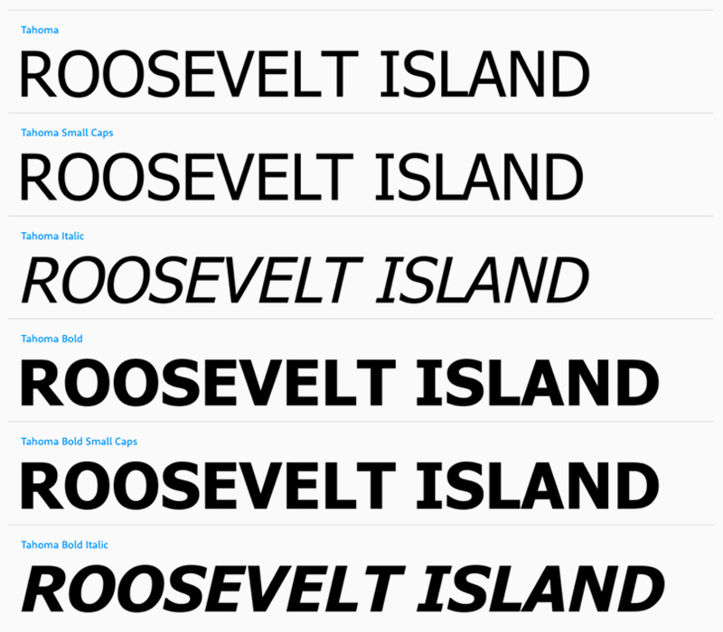
According to Wikipedia, Tahoma is a humanist sans-serif typeface that Matthew Carter designed for Microsoft Corporation. While similar to Verdana, Tahoma has a narrower body, smaller counters, much tighter letter spacing, and a more complete Unicode character set.
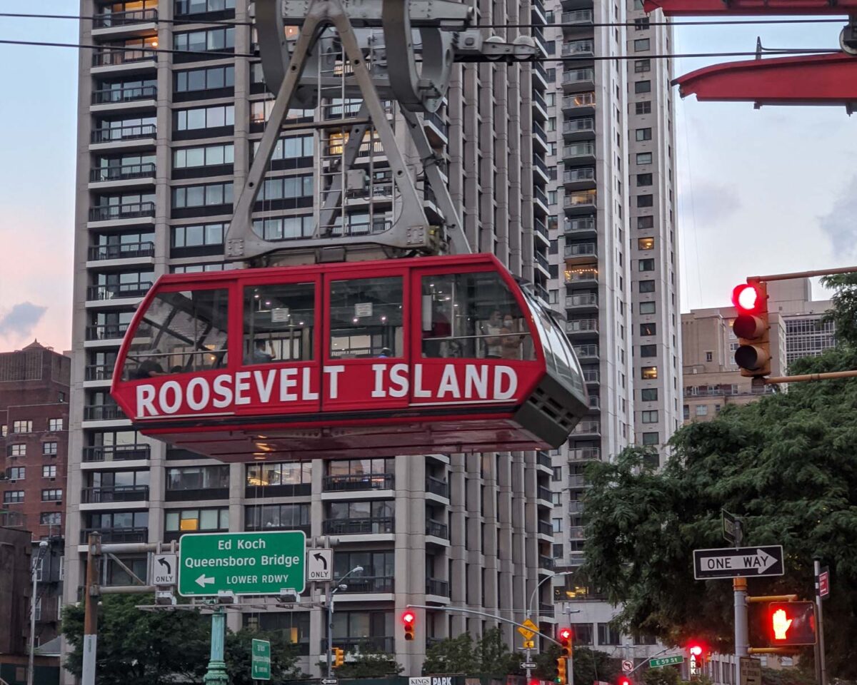
This one was much much harder than I had expected, and I spent over 5 hours looking for this one. Roosevelt Island tram is very iconic – the only cable car service in New York City, so I expected the typeface to be all over the internet.
I think this typeface is Tahoma Bold although I am not a 100%. The typeface of the tram is much more condensed than Tahoma Bold. My guess is that the designer squeezed this font to fit the width and the breadth of the cable car.
Notable characters
The letter ‘I’ is distinguishable as it has a serif like features (instead of a simple straight stem). Also the middle arm of letter E is slightly raised.
Similar typefaces
More reading
- Brief history of Roosevelt Island Tramway