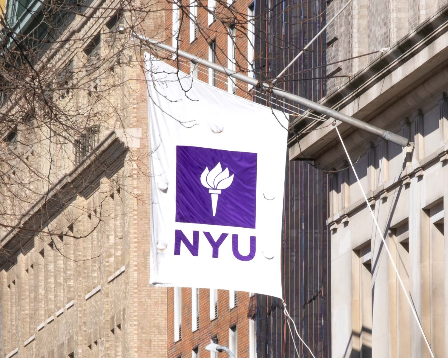
NYU
New York University (NYU) is a private research university in New York City. It was founded in 1831 by a group of New Yorkers with a goal of creating an institution for higher learning that would admit students based on their merit, rather than their family’s wealth or status. Today, NYU is the largest private university in the United States by enrollment and is ranked among the top 20 universities in the world. Located in the heart of New York City, NYU is home to some of the most prestigious academic programs in the world – the Tisch School of the Arts, the Stern School of Business and the School of Engineering. Over the years, the university has produced numerous notable alumni, including Noble prize winners, Pulitzer Prize winners and Academy Award winners.
Gotham typeface
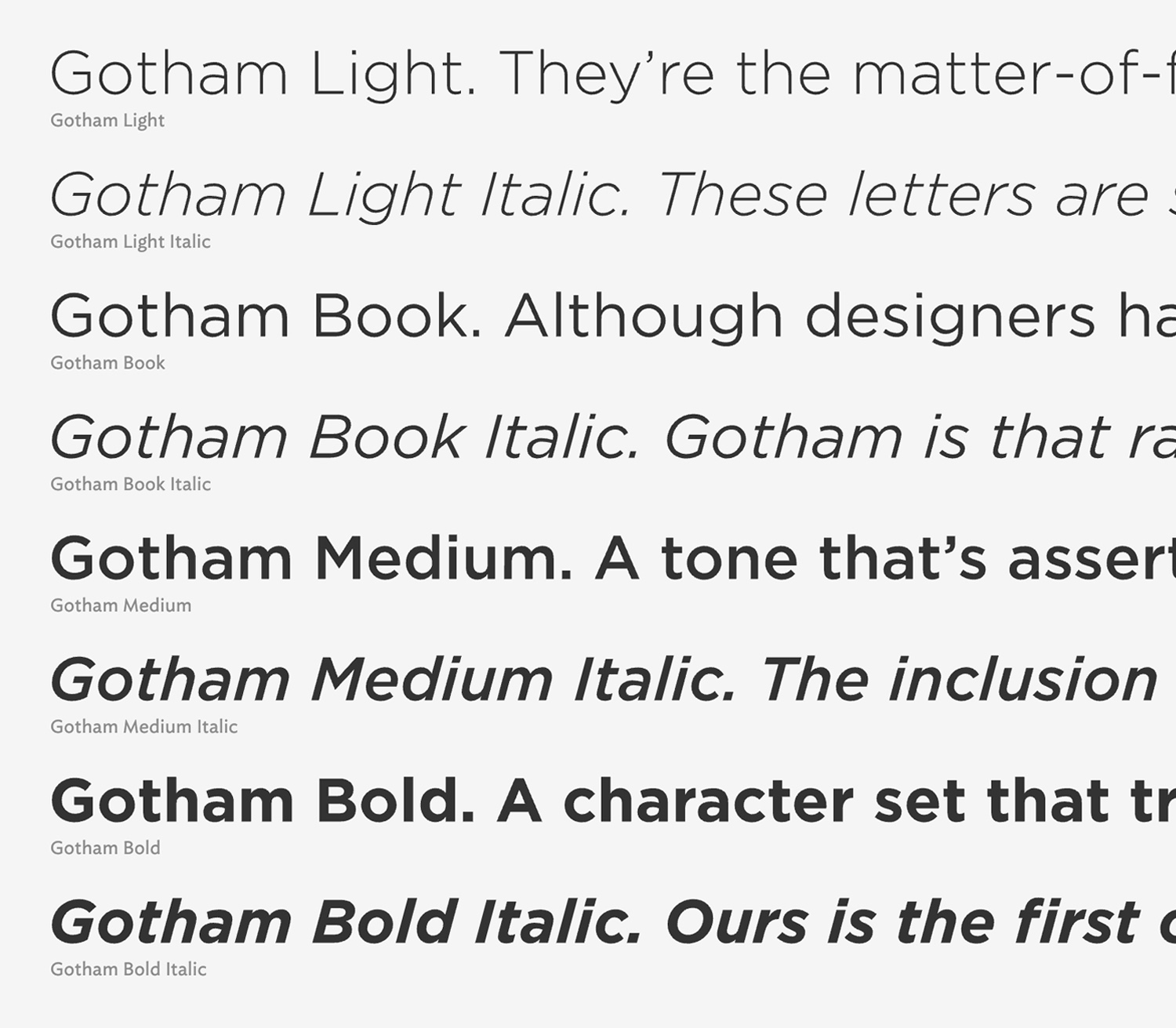
Gotham is a geometric sans-serif typeface designed by Tobias Frere-Jones and released through Hoefler & Frere-Jones foundry in 2000. The inspiration for the typeface came from the lettering seen on old buildings in Manhattan, especially the sign on the Port Authority Bus Terminal’s Eight Avenue facade.
Gotham has a relatively broad design with high x-height and wide apertures. According to Paul Shaw, author of “Helvetica and the New York Subway System”, Gotham’s letterforms are geometric yet they don’t look like Futura. Their widths are more uniform and less classical. Frere-Jones himself characterized the type as “not the kind of letter a type designer would make. It’s the kind of letter an engineer would make.”
Gotham was been heralded as an American typeface, that evokes the nonsense, bold, unassuming, architectural lettering of the mid-century New York. Andrew Romano of Newsweek commented, “Unlike other sans serif typefaces, it’s not German, it’s not French, it’s not Swiss,” he said. “It’s very American.”