NYPD
The New York Police Department (NYPD), is the primary law enforcement agency within New York city. Established on May 23, 1845, the NYPD is the largest, and one of the oldest, municipal police departments in the United States.
Stymie Typeface
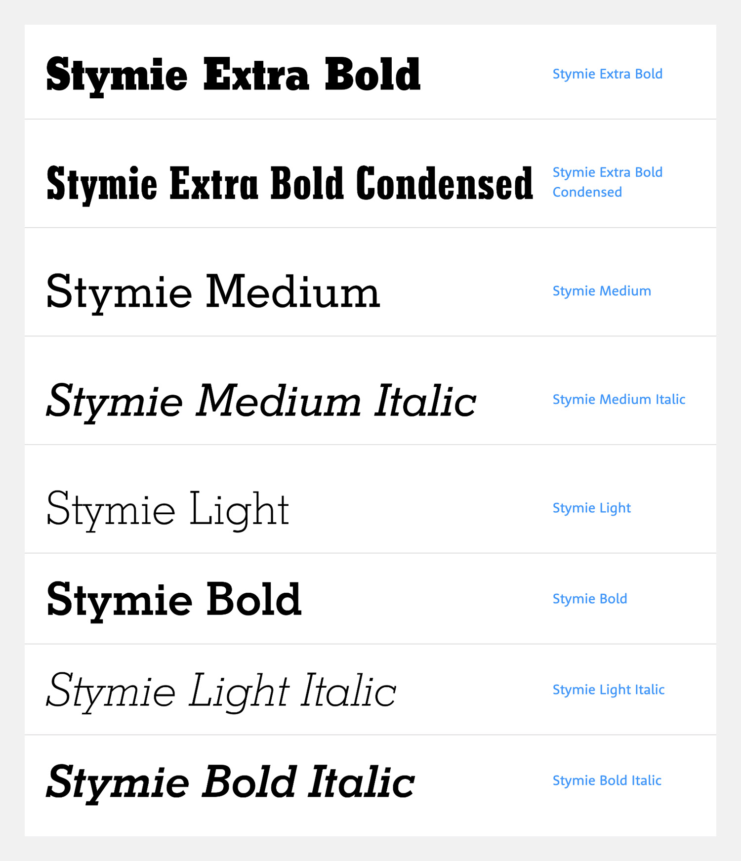
Stymie is a slab-serif font designed by Morris Benton at American Type Foundry (ATF) in 1931. According to Luc Devroye, Stymie Bold is a redesign of Rockwell Antique, which in turn was a reissue of Litho Antique, introduced by Inland Type Foundry in 1910. Rockwell appeared in 1931, but Morris redesigned it as Stymie Bold in the same year, refining some characters and generally tightening the fit. Stymie Light and Medium and their Italics were also drawn by Benton in 1931, and the series quickly became very popular.
Monotype exercised its option to copy ATF typefaces soon after the introduction of these typefaces—too soon, in fact, because they copied Rockwell and in some literature called it Stymie Bold, and there has been confusion between the two typefaces ever since, with some Monotype users applying the latter name to the older face. The actual Stymie Bold was duplicated by Monotype about 1936.
Monotype did its part in expanding the family. Sol Hess designed Stymie Extrabold in 1934, a year before Morris Benton drew Stymie Black. These heavy versions differ slightly from each other and from the lighter typefaces. It’s a matter of opinion as to which is more compatible with other Stymies. Sol Hess and Monotype also produced Stymie Light Condensed, Medium Condensed, and Extrabold Condensed, in 1935 and 1936. Gerry Powell drew the last major member of the family in 1937, with Stymie Bold Condensed, which departs a little more than the others from family characteristics.
Observations
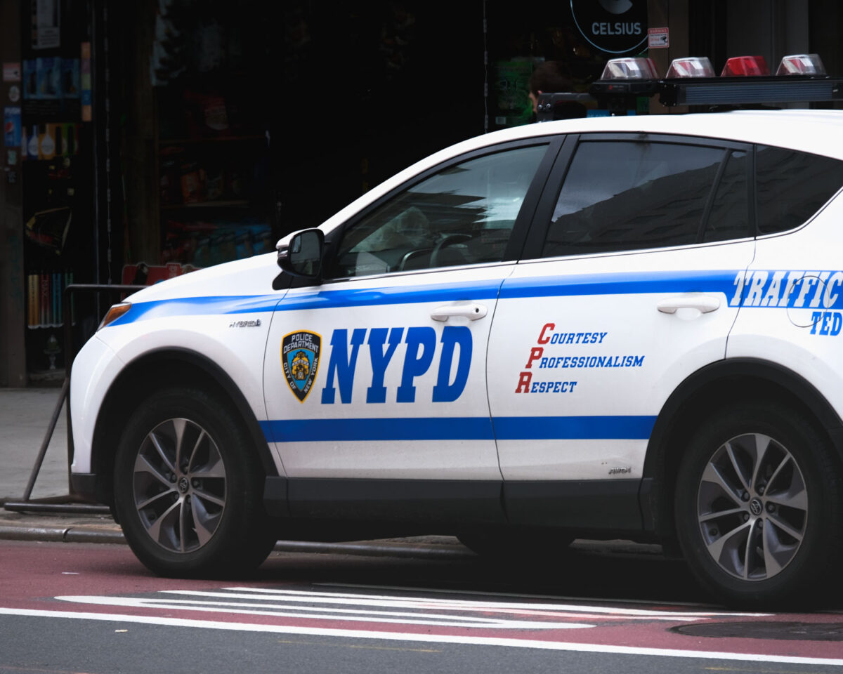
Initially, I was convinced that NYPD uses Rockwell. Even Wikipedia, suggests that the police vehicles have the letters “NYPD” printed in Rockwell Extra Bold. All I needed was to match Rockwell with the NYPD lettering. I spent some time looking for an Italics version of Rockwell Extra Bold but it proved harder than I thought. After spending hours, I still couldn’t find Rockwell Italics that would match the NYPD logo. This prompted me to look at other typographic samples.
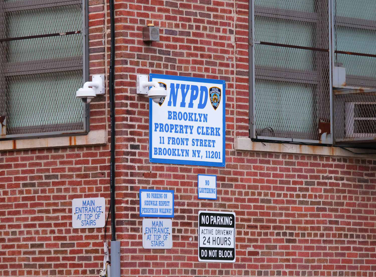
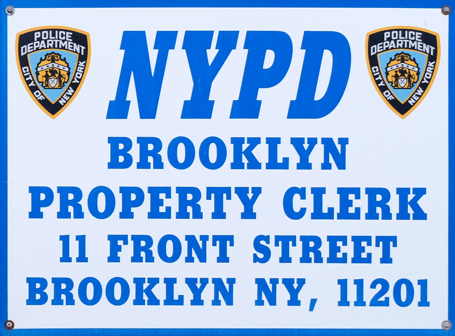
I started to test Rockwell Extra Bold for new word samples. It didn’t take me long to find out that Rockwell wasn’t the perfect fit. While most characters matched, the letter “R” stood out. The leg of “R” in Rockwell is straight compared to the sample plaque. A very small difference. Nevertheless, it was enough for me to go searching again.
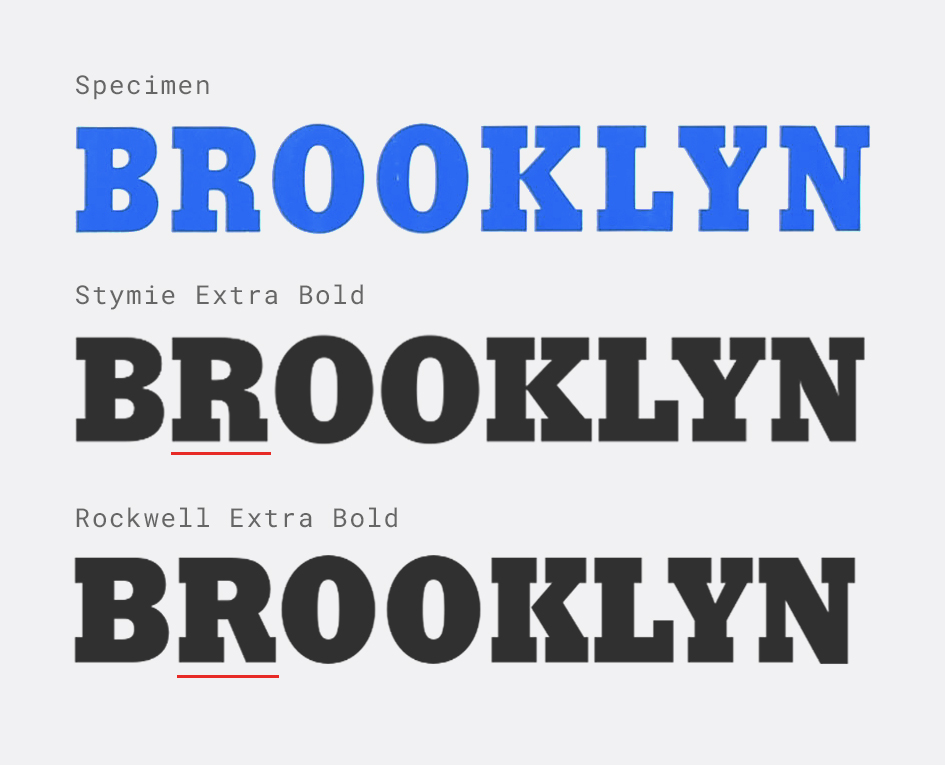
My renewed search started with looking for similar typefaces. Wikipedia notes that Rockwell was influenced by a style of geometric slab that were popular around the time, including Memphis, Beton, Stymie and City. This led me to focus on Stymie, and after trying out samples with Stymie Extra Bold, I decided to call this one in favor of Stymie.
Rockwell and Stymie share a lot of similarities. And once you’ve read the history of these typefaces, the similarities makes sense. It is possible that the original NYPD logo was designed with Rockwell, and subsequent works were done in Stymie. But given that Stymie matches not just the NYPD logo but also other samples as well, I’d just use Stymie.
Similar Typefaces
- Rockwell by Monotype
- Stafford Serial by SoftMaker