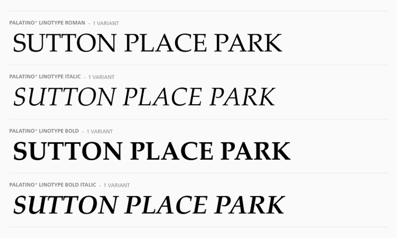
Palatino typeface
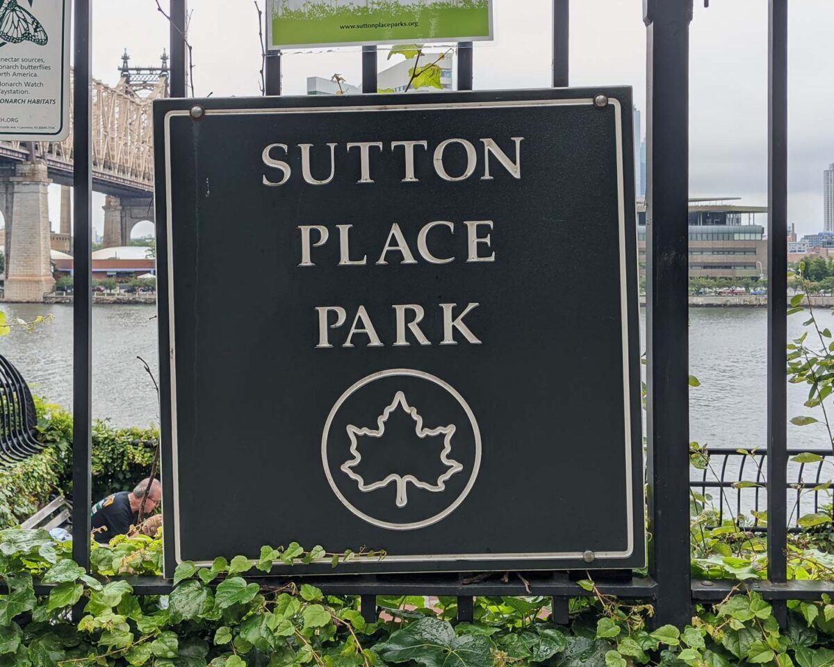
From Wikipedia: Palatino is the name of an old-style serif typeface designed by Hermann Zapf, initially released in 1949 by the Stempel foundry and later by other companies, most notably the Mergenthaler Linotype Company. The font was named after Giambattista Palatino, a master of calligraphy from the time of Leonardo da Vinci. Palatino is a typeface based on classical Italian Renaissance forms.
Notable features
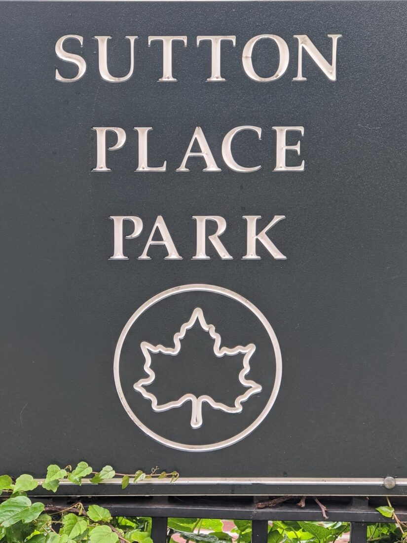
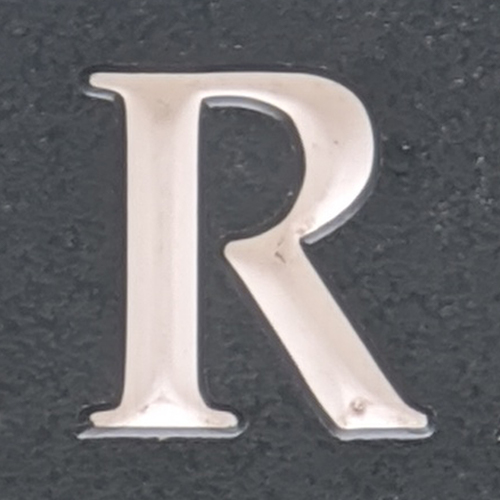
The letter P and R doesn’t connect back to the stem. When I noticed this at first, I thought this was some sort of embossing quirk, but it turns out to be a pretty subtle detail.

The lower part of ‘C’ is not symmetric to the top part, which sets it apart from other serif typefaces.
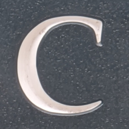

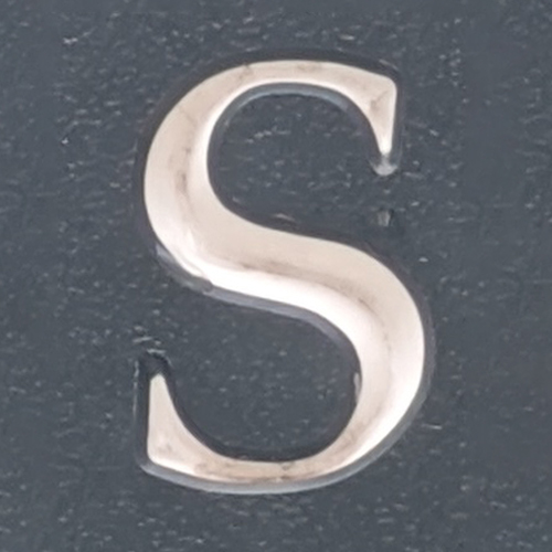
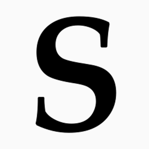
Lastly the serifs on letter ‘S’ and ‘C’ don’t stick out, rather it feels sanded in.
Similar typefaces
- Zapf Calligraphic by Bitstream
- URW Palladio by URW
- Book Antiqua by Monotype
More reading
- Older New York Park signs by Forgotten New York
- Redesign of New York Parks sign by Pentagram