About Highway Gothic
From Wikipedia: Developed in the 1940s, Highway Gothic (formally known as the FHWA Series fonts or the Standard Alphabets for Highway Signs) is a series of sans-serif typeface developed by the United States Federal Highway Administration. It was designed to promote legibility from a distance and at high speeds.
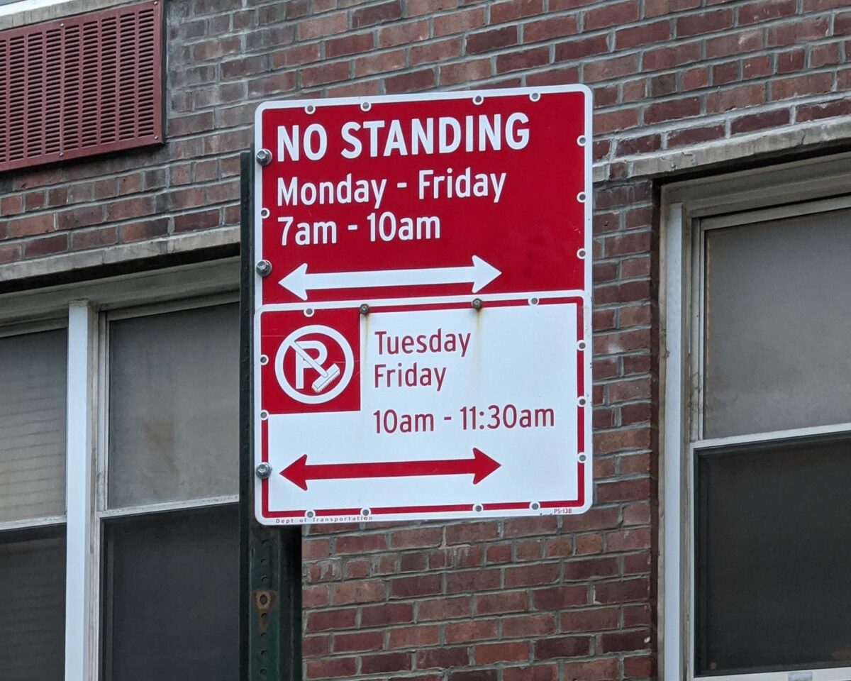
The thing that stood out to me was the angled cuts on alphabet stems, which made it easy to identify the typeface.
Similar type faces
- Interstate – Developed by Tobias Frere-Jones based on the original FHWA series.
- Overpass – Open-source replacement for Interstate commissioned by Red Hat.
More reading
- Highway Gothic on Wikipedia
- Review of Highway fonts by Font Review Journal
- Design of NYC parking signs by Pentagram
- How Clearview typeface improves the legibility of Highway Gothic, and is offered as an alternative for Highway signs. Article by Bloomberg.
Other roadway signage fonts
- New Transport – Designed by Margaret Calvert & Henrik Kubel for UK motorway system.
- Roadway – Based on US highway lettering system, can be seen in New York Street signs.