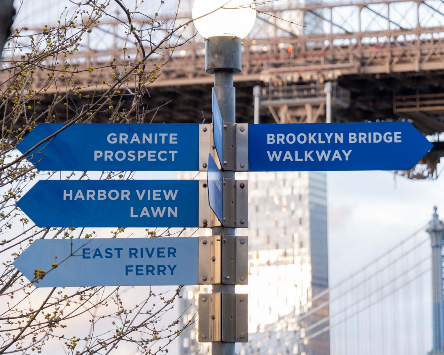
Brooklyn Bridge Park
As the name suggests, Brooklyn Bridge Park is an 85-acre park in Brooklyn that spans over 1.3 miles of East River’s waterfront, from Manhattan Bridge in DUMBO to the Columbia Heights waterfront district. The park offers breathtaking views of Lower Manhattan’s panoramic skyline, making it a popular hangout spot among the tourists and New Yorkers alike. Before the opening of Brooklyn Bridge in 1883, the Park’s waterfront was the primary ferry route between Brooklyn and Manhattan. And similarly, park’s piers 1-6 were once used by larger ships and cargo. In early 2000s, a redevelopment plan for the area was proposed, resulting in the park that we see today.
Gotham Typeface
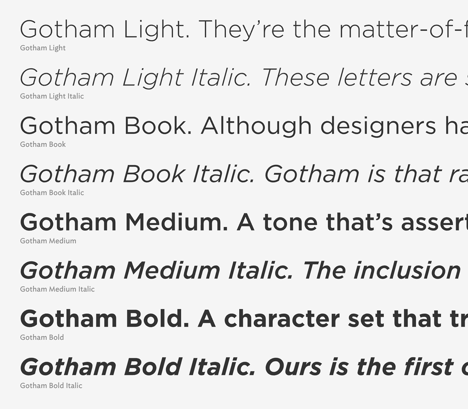
Gotham is a geometric sans-serif typeface designed by Tobias Frere-Jones and released through Hoefler & Frere-Jones foundry in 2000. The inspiration for the typeface came from the lettering seen on old buildings in Manhattan, especially the sign on the Port Authority Bus Terminal’s Eight Avenue facade.
Gotham has a relatively broad design with high x-height and wide apertures. According to Paul Shaw, author of “Helvetica and the New York Subway System”, Gotham’s letterforms are geometric yet they don’t look like Futura. Their widths are more uniform and less classical. Frere-Jones himself characterized the type as “not the kind of letter a type designer would make. It’s the kind of letter an engineer would make.”
Gotham was been heralded as an American typeface, that evokes the nonsense, bold, unassuming, architectural lettering of the mid-century New York. Andrew Romano of Newsweek commented, “Unlike other sans serif typefaces, it’s not German, it’s not French, it’s not Swiss,” he said. “It’s very American.”
Comments
One response to “Brooklyn Bridge Park / Gotham”
[…] Brooklyn Bridge Park / Gotham […]